There is a lot of information online about what a business website should have and how to organise it to win customers. We find recommendations on design, copy, buttons, colours and ways of presenting services. There are professionals and agencies whose job is precisely to study these questions and improve every part of a website.
Even so, who hasn’t visited a company’s website and failed to quickly understand what it does? Or known what they were looking for but struggled to find it? And when they try to find out who is behind it, they don’t find a clear explanation either.
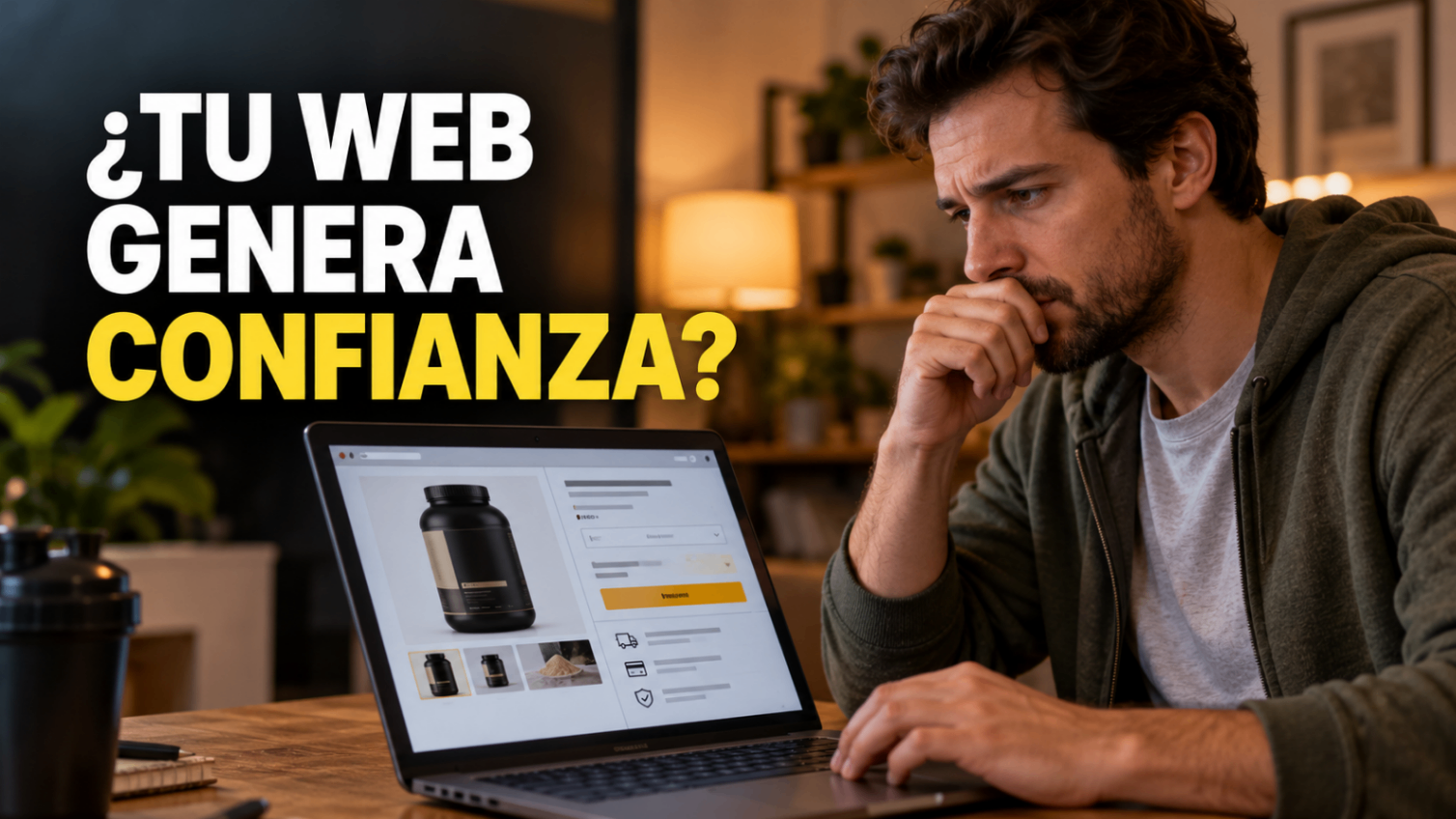
It happens to me often. A couple of days ago I was trying to buy a tub of protein from a specific brand. I knew which product I wanted; I needed to compare the purchase conditions and choose a store I trusted.
I visited about five before deciding. The first four made me hesitate for different reasons. In one, the payment gateway was unfamiliar to me and I couldn’t find enough information to feel reassured. In another, I couldn’t find the store’s policies. In another, I couldn’t clearly see where to enter the delivery address, and it seemed they were asking me to pay before clarifying that step.
I can’t claim those stores were unsafe. What I can tell you is how they made me feel: I had doubts and couldn’t find answers where I needed them.
I already wanted to buy. The brand and the product were chosen. Yet I ended up looking for another store because I didn’t feel comfortable completing the order.
That experience made me think about the opportunities a website can let slip because of details that, from inside the business, may seem small.
Building a website that inspires trust is harder than it looks
Over the last few days, while working on our own FEIDERS website, I have been able to see it from the other side.
Although the copy and structure were written and reviewed by professionals, I have realised that getting a website to explain what you do well and give people confidence is genuinely hard.
You know your business. You know what you offer, how you work and what each service means. But someone arriving for the first time doesn’t share that context.
Something that is clear to you may be confusing to them. A button that seems obvious to you may go unnoticed. An explanation you consider sufficient may leave the question they really care about unanswered.
On top of that, after several days reviewing the same page, you start reading it with what you already know. It is hard to look at it like someone who has just arrived.
That is why I decided to write this article: to explain what a business website should have, at the very least, so that a person can understand it, trust it and move forward.
1. A clear explanation of what you do and who for
The first part of your website should help visitors recognise whether they have come to the right place.
Imagine you are looking for a company to renovate your bathroom. You visit a page and read: “We transform spaces, we create experiences.”
The phrase may sound good, but you still need to know whether they renovate homes, whether they take on small jobs and whether they work in your town.
A headline such as “Bathroom and kitchen renovations in Madrid” clears up an important part of those doubts. Then there will be room to explain how they work and what sets them apart.
Before choosing a slogan, it is worth checking whether the first screen makes it possible to understand:
- What product or service you offer.
- What kind of customer you serve.
- Where you work, when location matters.
- What the person can do next.
You can test this by showing the page to someone who doesn’t know your company. Ask them to tell you what they think you sell and who to. Their answer may reveal things you no longer see.
2. Services or products that can be understood and compared
Once visitors understand what you do, they need to know whether what you offer fits their case.
On a services website, writing “Consulting”, “Comprehensive solutions” or “Personalised advice” usually leaves too many questions open.
What does it include? Who is it for? How does the work start? What does the client need to provide? Is there any condition they should know about?
An academy, for example, may advertise English classes. But someone looking for a course probably wants to know the level, format, timetable, duration and how to enrol.
In a store, the information changes: features, size, variants, availability or delivery conditions. In my protein purchase, confirming the exact format of the product was part of the decision.
When you offer different services, giving each one its own page can help you explain them better. What matters is that each page meets a specific need and has its own information.
People should be able to assess your offer without having to write to you to find out all the basic details.
3. Real information about who is behind it
Before sharing data or paying, it is reasonable to want to know who you are dealing with.
An “About us” section can help a lot if it presents specific information: who runs the business, what experience the team has, how they work and how they relate to what they offer.
Phrases like “We are a team passionate about excellence” add little if they could appear on any website.
If you are an independent professional, you can present yourself as such. If you are a small company, you can explain who takes care of each part. Showing the real size of the business helps set expectations.
Original photographs, a clearly explained track record and consistent contact details make it possible to get to know the people who will handle the enquiry.
You don’t need a spectacular story. You need visitors to understand who will take responsibility for the work and how they can communicate with that person or team.
4. Evidence that lets people assess your work
Saying you do good work is easy. Showing something that lets people check it takes more effort, but it also helps potential customers more.
Depending on your activity, you can show projects, photographs, demos, work samples or testimonials you have permission to publish.
A renovation company can explain what the client needed, what was done and what difficulties came up. A designer can show a piece and explain the decisions they made. An academy can show part of its materials so students get to know its approach.
Context matters. A nice photograph shows the result; a short explanation helps people understand the work behind it.
If you are just starting out and don’t have clients yet, you can show your own projects or examples of what you can do, labelling them correctly.
At FEIDERS we distinguish illustrative examples from completed projects. That difference lets us explain possibilities without presenting an imagined situation as a real experience.
5. Answers to the questions that come up before getting in touch
Some people interested in a service aren’t yet ready to call.
They may be comparing providers. They may need to know whether you take on a certain type of project. Or they may simply want to understand how you work before sharing their phone number.
Your website can answer many of those questions.
A good starting point is the conversations you already have with customers: what they ask at the start, which conditions you always have to explain and which misunderstandings keep coming up.
Those questions may include:
- What the service includes and what is quoted separately.
- What the stages of the work are.
- What information you need to prepare a proposal.
- Whether you cover a particular area.
- What happens after a request is sent.
The answers should be close to the corresponding decision. If someone is reading about a service, it is worth them finding its main conditions right there.
A frequently asked questions section can complement that information. So can an assistant, if it is well prepared, although the essential details should still be easy to find on the website itself.
6. A clear next step suited to your business
Once someone understands the offer, they need to know how to move forward.
That step may be requesting a quote, booking an appointment, checking availability, buying or sending a question. The choice depends on how your activity works.
A renovation company may need to know the type of work before suggesting a visit. A beauty salon can let people choose a service and a time. A consultant can offer a first conversation to assess the case.
Buttons should describe those actions clearly. “Request a quote” or “Check times” help people anticipate what will happen next.
What happens when they are clicked matters too. If visitors want to ask about a service, they should reach a form related to that enquiry rather than getting lost on a generic page.
When you ask for data, ask for what is needed at that moment. Once it has been sent, confirm the request has arrived and explain the next step with expectations you can meet.
7. A purchase or booking process that doesn’t raise doubts
This brings me back to my experience buying protein.
Finding the product was only part of the journey. As I moved towards payment, I needed to understand the total price, the delivery conditions and where to enter my details.
When any of those steps was confusing, my attention shifted from the product to a question: “Should I carry on here?”
In an online store it is worth reviewing the whole journey: what information is shown before payment, how data is entered, when additional costs appear and what confirmation the buyer receives.
Bookings are similar. People need to distinguish between requesting an appointment and having it confirmed, know whether they have to pay and understand how to change it if a problem comes up.
Test those journeys from start to finish. Also check what happens when a detail is missing or someone makes a mistake.
If you use an external provider for payments or bookings, review the transition. An unexpected change of screen can raise doubts even if the service used is legitimate.
8. A comfortable experience on mobile
It is easy to review a website on a large screen, especially while it is being built. But it is worth going through it on a mobile phone too.
Read a service page, open the menu, check the conditions and complete a test request.
Notice whether the text can be read without zooming in, whether the buttons are easy to tap and whether any element covers important information.
Pay special attention to forms. A field that is hard to fill in, an unclear error message or a hidden button can interrupt an enquiry that was already under way.
Images and animations should also make the experience easier. If they delay access to the content or make an action harder, it is worth reviewing how they are used.
The practical question is simple: can someone do what they came to do from their phone?
9. Terms and policies that are easy to find
In a purchase, being able to check the terms is part of trust.
As a customer, I want to know who I can write to if there is a problem, how delivery works and where to check the terms that apply to my order.
A service company may also need to clarify questions about payments, cancellations, scope or the processing of the data it collects.
The documents and notices required will depend on the activity, where the business operates and the website’s features. It is worth reviewing them with proper advice and making sure they describe what you actually do.
From the user’s point of view, there is a basic check: that they can be found and understood.
A broken link, a policy that mentions another company or terms that contradict what was stated during the purchase can create distrust precisely when the person is making a decision.
10. A way to check whether the website is working
After publishing, you need to observe what happens.
You can start with specific questions: are enquiries coming in? Are bookings being completed? Do the forms work? Do messages reach the right person?
It is also worth listening to what customers ask. If almost all of them need to confirm whether you work in their area, perhaps that information should be more visible. If you get requests for services you don’t offer, some copy may be creating the wrong expectation.
Measurement tools can provide additional information, always with the appropriate configuration and permissions. But even before interpreting statistics, you must check that the essential actions work.
An enquiry sent correctly should reach the team. A purchase should be recorded. A booking should show the right status.
Those checks connect the website to the day-to-day work of the business.
What to review before adding more features
A website can add bookings, a store, content, a private area or an artificial intelligence assistant. Each feature needs a clear purpose and someone to maintain it.
Before adding one, I would review these questions:
- Is it clear what we do and who for?
- Can someone assess our services or products?
- Is it clear who is behind it?
- Is there real evidence of our work?
- Do we answer the usual questions?
- Is it easy to get in touch, buy or book?
- Do those journeys work on mobile?
- Can the relevant terms be found?
- Do we know what happens after each request?
While we were preparing FEIDERS, going back to these questions helped us spot explanations that needed more context and journeys that needed reviewing.
Knowing the business from the inside doesn’t prevent these problems. That is exactly why it helps to ask someone else to go through the website and try to do something specific.
My experience buying protein left me with a very simple idea: even when someone already wants to buy, they still need to feel confident to complete the step.
That also applies to someone looking for a renovation, a course or a professional. The website can help them clear up their doubts and move forward with confidence.
If you are preparing your business website or want to improve the one you already have, at FEIDERS we can review with you what your customer needs to understand, what action they must be able to complete and which features make sense for your activity.